Ground Truth: The Weavers Encoding Real Places into Cloth
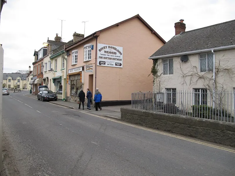
Photo: David Hawgood, CC BY-SA 2.0, via Wikimedia Commons
There is a particular kind of British cloth that has started to feel like a map you can wear. Not a printed map, and not a pastel souvenir either. More like a set of decisions—about sett, shrinkage, yarn twist, the way a reedbed moves in wind—compressed into a length of fabric. The makers behind it are often careful, sometimes guarded, and increasingly aware that "inspired by the landscape" is one of the easiest phrases in textiles to say and one of the hardest to prove.
So how does a place actually get into a weave? And when does that become a useful form of provenance rather than a marketing shortcut?
From place to pattern
Most of the weavers doing this work start with recording, not styling. A Norfolk reedbed might be logged as vertical density: tall stems, interrupted horizontals, the way light sits in bands across water. A Welsh hillside is more often a gradient problem—peat, bracken, sheep-cropped grass, cloud shadow—which can translate into clasped weft, a graded warp, or a tapestry approach where colour changes happen slowly and slightly unevenly.
Urban grids ask different questions. A city block is regular until it isn't: alleys, loading bays, post-war infill, the odd surviving terrace. Weavers who work with urban references often end up using block weaves, double cloth or modular threadings, because the interesting part is the interruption rather than the grid itself.
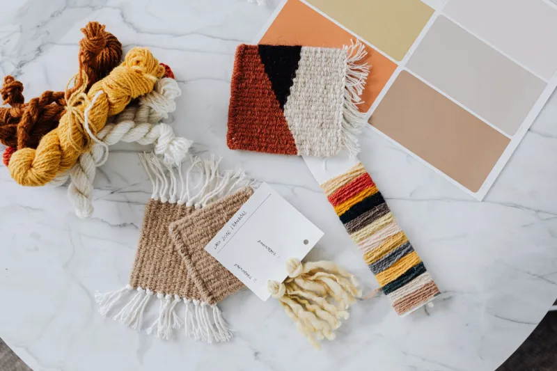
The practical step is usually sampling. Not one sample, but a series: a fine wool at 12 ends per centimetre, then the same palette at 18; a paper sketch translated into a liftplan, then redrawn because the float lengths look wrong at loom scale. Place-based weaving gets credible when the maker can explain the translation and the compromises. "The hillside was too soft to weave literally," one designer told me, "so I made the cloth harder and let the colour do the softening."
The awkward business of encoding
Encoding a landscape is not a neutral act. A weave draft is a set of rules, and rules flatten things. A reedbed becomes repeatable verticals; a hillside becomes a gradient; an urban grid becomes a block structure. That is fine—cloth is not a photograph—but it does mean the maker has to decide what the place is for in the design. Is it a compositional prompt, a colour source, a structure, or a claim?
The strongest work tends to use place at two or three levels at once. Colour from local dye plants or mineral-rich soil. Structure from a specific visual rhythm. And a material decision that comes from the place itself—a local fleece, a mill-spun yarn with a regional supply chain, a warp that behaves like the weather the place is known for. The weaker work uses a place name as a title and a palette as evidence.
This is where the critical question sits. Place-based weaving can deepen provenance when it is tied to verifiable materials, documented research and a maker's own time on the ground. It becomes shorthand when the landscape is invoked but the cloth could have come from anywhere.
What provenance actually needs
Provenance in textiles has become a more practical conversation than it was a few years ago. Batch numbers, mill records and fibre traceability now sit alongside the more romantic language of place. For landscape-led work, that means being specific about what has been sourced locally and what has not. A Welsh hillside palette might use British wool but a silk binder from elsewhere. A Norfolk reedbed piece might use local reed as a reference point but an imported linen warp because the behaviour is right.
That is not a failure. It is honesty, and it is more interesting than a vague claim of locality. Buyers—especially in the UK, where the language of craft has been stretched by everyone from heritage brands to high-street labels—are getting better at asking which part is local. The answer should be available without a defensive shrug.
The map-scarf problem
There is also a design risk that rarely gets discussed: the map-scarf problem. When a place is translated too literally, cloth can end up looking like merchandise. Coastline becomes a border print; contour lines become stripes; a town's grid becomes a checked scarf with a story attached. It sells, and it is not necessarily bad, but it is a different thing from cloth that carries a place in its structure.
The weavers who avoid this tend to be the ones who spend time in the place without a camera. They notice maintenance, not just vista. A reedbed is managed. A hillside is grazed. An urban grid is patched. Those less picturesque facts often make better cloth, because they introduce irregularity, repair and use—the things that make a place feel lived in rather than viewed.
Why it matters
Place-based weaving is part of a wider shift in UK textiles towards work that can explain itself. Not just the story of the maker, but the story of the material and the reasoning behind the design. At its best, it gives buyers a way into cloth that is more than colour matching: a sense that the structure has been thought through in relation to somewhere real.
At its worst, it is a mood board with a postcode. The difference is usually visible in the sampling and audible in the answers. Ask a weaver what they changed after visiting the site, and you will learn quite quickly whether the landscape is in the cloth or just on the label.
For makers, the useful discipline is to document the translation: photographs, notes, yarn cards, failed samples, the draft that didn't work. For buyers, the useful question is simpler. Which part of this cloth actually came from there? A good answer does not need to be a whole landscape. It just needs to be true.